A Fresh Look At Color Theory
A few weeks back, I put out a call on Rowan Made’s instagram to see what all of you wanted to see more of around here. One of the surprising responses I got was centered around color theory, something that I honestly never even considered covering before. Because: Who Am I to talk about color when you can find details all over the internet?
After giving it some more thought, I decided that I’d give it a go since my approach isn’t 100% what you’d expect. It’s more of a "logic mixed with magic" kind of thing. Sound weird? Probably. So let’s go over it together.
COLOR WHEEL
We’re going to start with the color wheel, because it’s legit and, well, #tradition. I’m assuming that most of you have some sort of background with this, but basically: red, yellow, and blue are primary colors, while orange, green, and violet are secondary colors. There are also a few “connecting” colors in between that are labeled as tertiary. Here’s a fancy chart for all of you visual folks.

At it’s core, the color wheel is a wonderful way to experiment with creating color palettes, especially if you haven’t done so before. There are a few common ways you can go about doing this:
COMPLEMENTARY: Choose a color from the wheel and then find the direct opposite of it on the other side (ie: yellow and violet). This creates more of a high contrast feel that vibrates nicely on the eyes.
ANALOGOUS: This kind of palette is formed by selecting colors that are next to each other on the color wheel. They tend to feel very blended and thus, harmonious and pleasing to the eye.
TRIADIC: These palettes are found by forming a triangle within the color wheel. Think: red, yellow, and blue or orange, green, and violet. They are evenly spaced and tend to feel highly vibrant. Because of this, most people choose to lighten 1-2 of the colors so that only one acts as a focal point.
If I’m drawing inspiration from any of the above combinations, I don’t typically use straight up red, yellow, blue, etc. I’ll simply use the “idea” of them as a base and alter depending on the mood of the project (more on that below). So for now, just know that it’s OKAY to get a little funky here. Don’t like straight up red? Maybe you need to skew the color towards orange or violet. Rules are meant to be broken. ;)
And if you’re sticking to traditional combinations that are based on the color wheel, try adding a few neutrals (black, grey, cream, white, etc.) to round everything out. Here are a few palettes that are loosely based off of the color wheel:

While the color wheel is a great start, it’s only step one. At least in my opinion. In reality, color psychology plus a little magic (or intuition) are both key ingredients to the development of a palette that not only shines, but is rooted in strategy.
COLOR PSYCHOLOGY
Good design utilizes a variety of elements, from typography and composition, to illustration and imagery, all of which work together towards one cohesive solution. But among these, the impact of color is arguably one of the most important considerations a designer can make.
Think of it this way: while a bright red feels loud and urgent, a lighter green establishes comfort and peace. In fact, every color under the sun evokes a certain kind of emotion or energy, so it’s important to have a good understanding of the basics. Let’s take a look at our primary and secondary colors, for example:
RED is the color of fire and blood. It’s loud, highly visible, and quite intense. Needless to say, it grabs people’s attention as urgent, which is why you see it on things like stop signs, stop lights, and clearance tags. Also, Target.
ORANGE blends the energy of red with the happiness of yellow, giving it a variety of associations like creativity, autumn, citrus, and warmth. It sits well with a younger(ish) audience and I can’t help but think of Nickelodeon and Halloween here.
YELLOW is the color of the sun. It evokes many of the same emotions that orange gives (like happiness, warmth, citrus, etc.), but takes it a step further with pleasantries and cheer. Picture the smiley face stickers they used to give out (or maybe still do??) at Walmart. Also, McDonald's.
GREEN represents nature, growth, and freshness. But it also has strong ties to things like money, stability, and safety. Think of “green means go” in a stoplight, and you’ve got the opposite (complementary) of red.
BLUE is the color of both the sky and sea. Up and down. It evokes wonder and wisdom, while possessing a calming effect. There’s stability and trust and all sorts of good things associated with blue, just not it’s ability to suppress an appetite. ;) It’s widely used within the tech industry (like Twitter) for obvious reasons.
PURPLE blends the stability of blue with the energy of red. It’s powerful and luxurious, but also has a creative and mystical side to it as well. Children love it and I can’t help but think of Willy Wonka for this one.
View source
for more information.
Because color plays a huge role in attracting the right audience (ie: your target market), the above descriptions become a good indicator of where the project’s palette should begin. For example, one of the projects we’re currently working on is for a wellness brand. And since the color green is widely associated with nature and health, we used that as a starting point and grew from there.
Now, palette creation isn’t always as straightforward as my example above. In fact, it’s usually not. But luckily, that’s where the “magic” I’ve been talking about comes into play.
PALETTE MAGIC
Once you have a good handle on color theory, it’s much easier to dig deep, explore, potentially break some rules, and ultimately create a palette that speaks volumes for the brand it represents. I know this may seem easier said than done, so I’m going to walk you through our specific approach, step by step.
01. The first thing we do with any new project is get to know our clients inside and out. Our questionnaire, which I hope to cover in more detail down the road, covers the following topics: business history, target market, competition, and brand ethos. These areas give us a good overview of who are clients are, what they represent, where they’ve been, and how they need to move forward.
02. As we review a client’s questionnaire, we take notes. A LOT of notes. Most of this includes writing down key words or phrases that continually come up, but we also begin to incorporate our own design expertise (and insight) as well. In the end, there’s typically 1-2 notebook pages full of buzzwords, ideas, and rough sketches.
03. The previous two steps are rooted in logic for a reason. It allows us to fully immerse ourselves within the brand while establishing a solid understanding of what’s going on. Then, and only then, do we bring “magic” into the mix. And when I say “magic,” what I really mean is that we look at the facts and explore color from a place of intuition. Or, gut based selection.
To do this, I’ll close my eyes, picture the brand’s buzzwords, and make note of what colors pop into mind. Sometimes, my gut is right, while other times, I’ll double check myself by circling back to the original facts. Remember that creatives, in general, are intuitive beings. So this is a spot where you simply need to trust yourself and give it a try. Your knowledge of color theory will certainly back you up.
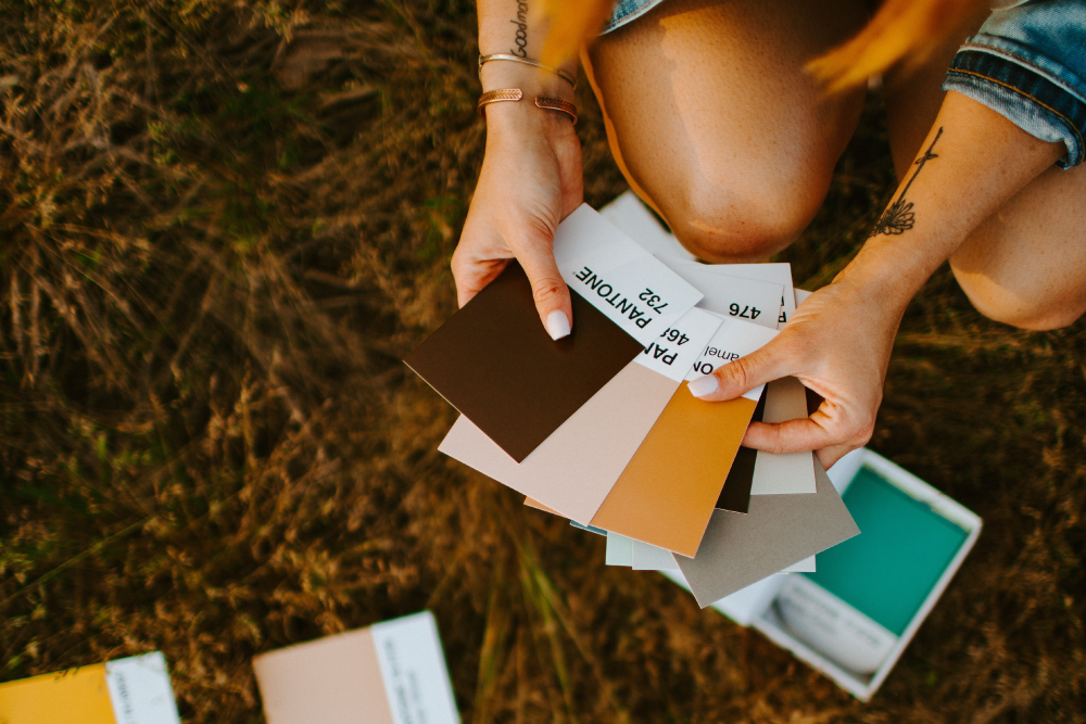
04. Once you have a preliminary idea of where to begin with color, it’s time to play around with palette creation. We do this in illustrator, but you could also do it with swatch books or whatever you have on hand, in person. To help explain a bit deeper, I’m going to tap into another example.
Do you remember the wellness brand I mentioned above? The color green was an obvious first choice, but we actually ended up nixing that idea rather quickly because of a negative gut reaction. Here are some of the buzzwords:
— Attainable
— Modern
— Casual + raw
— Simple, but edgy
— Young
— Fresh
This particular brand is all about helping busy moms feels young and awake again, through realistic fitness and health adjustments. Something like this could easily skew towards a more holistic aesthetic, but the continual use of words like “modern and edgy” encouraged us to think outside of the (green) box.
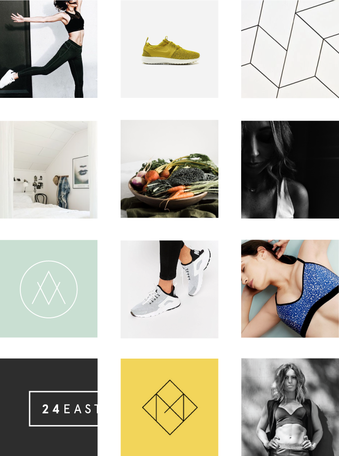
We needed something fresh and modern, but friendly just the same. Almost instantly, the color yellow came to mind. It’s light and happy, and when combined with black, modern. So we tried it out …

As you can see, the top palette certainly checks the modern box, but it almost felt too harsh. The words fresh, casual, and attainable didn’t feel accurately represented, so we toyed around with adding another color to help balance things out. And thanks to the color wheel, some sort of blue or green (analogously related) felt like a nice addition. Turns out, our gut was right. So ultimately, we mixed logic with a bit of magic and ended up with the following moodboard:
05. Here at Rowan Made, we’ve chosen to cut clients out of the moodboard process (learn why here), so naturally, that includes cutting them out of the color process as well. We do ask for initial benchmarks within their questionnaire, but ultimately, make decisions based on the brand’s best interest as well as our own expertise.
That said, we’re very much open to collaboration and discussion once a moodboard has been presented. But because we put a lot of time into the discovery phase, most boards (and color palettes) are generally approved. If not, edit requests are typically small.
* Also note that we never fully close the door on color, either. Throughout concept development, it’s not uncommon for new ideas or revelations to come up. And if they do, we’re transparent about that with our clients and make sure that any adjustments are done from a highly strategic place.
- - - - - -
Phew! That’s a lot of information. So if you have any lingering questions, don’t hesitate to let me know in the comments section below. Or, if you’re looking for a little more inspiration, check out the Coolors website. This is one of my favorite places to go for ideas when I need to get outside of my own head for a little bit.
PS. After writing this, I can’t help but feel absolutely gracious for the world of color. I work with it every single day, yet haven’t given it the kind of credit it deserves. So here you go, color. You're amazing and my job wouldn't be HALF as fun without you. ;)