New Work Green & The Grain
Green & The Grain is a mobile eatery and restaurant located in Minneapolis, MN. So when they approached me to rebrand their business earlier this year, it was a resounding YES PLEASE on my end because food AND local is a complete win-win (at least in my opinion). ;) When we first started chatting about the project, they had just finished a successful first year as a food truck and were about to expand into a retail space in the skyways of Downtown Minneapolis.

Tiffany (co-owner) had big dreams for this new space. Think: light + airy (but warm), minimal color palette (black & white), concrete floors, wooden tables, and tons of green accents (because that's what they're all about after all). But this also meant that they needed to consider a professional rebrand to better match this new space as well as the future of the company. Ultimately, we decided to take a more modern + fresh approach and came up with the moodboard below:
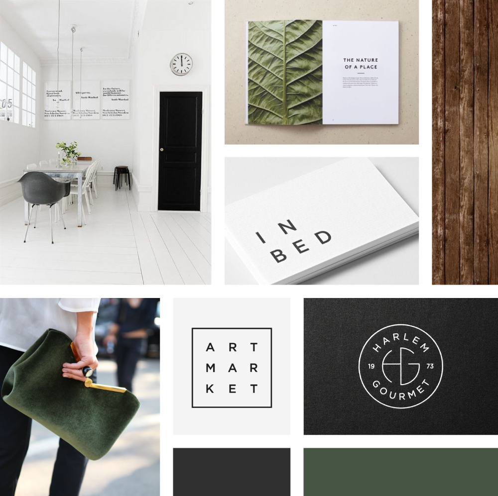
As you can see, sans serif typography, fresh white space, clean lines, and a warm color palette all helped make the general direction of this brand extremely clear from the get go. During the initial concept development phase, I focused on two somewhat similar (yet different) ideas. The first was minimal, modern, and to the point. The other was also simple, but felt a bit more welcoming in it's approach with the use of a round composition. You can see some of the very first ideas that were presented to the Green & The Grain gang below.

For the first revision, Tiffany enjoyed the circular composition, but wanted to see some other illustration ideas for the center of the logo. They were used to their existing leaf mark (which I'll talk more about later), so seeing something new was more of an emotional experience in letting go than expected. Needless to say, I got a little carried away with trying out new illustrations as line art is one of my favorite things to play around with. You can see some of the ideas below, although not everything was presented because too many options isn't always the best idea. ;)

While fun, none of these illustrations seemed to stick. Their original mark (not yet pictured here) continued to be brought back into our discussions, so I suggested giving it a tiny facelift (instead of re-inventing) and using it to connect their past, present, and future. That was a major turning point in our project together, where the rest of the identity fell into place just like that. Ultimately, we decided to use the circular composition (with their updated mark inside) as their NEW mark. We then utilized one of the original designs (top left of first grid above) for their primary logo with a few changes. You can see the final selects below!


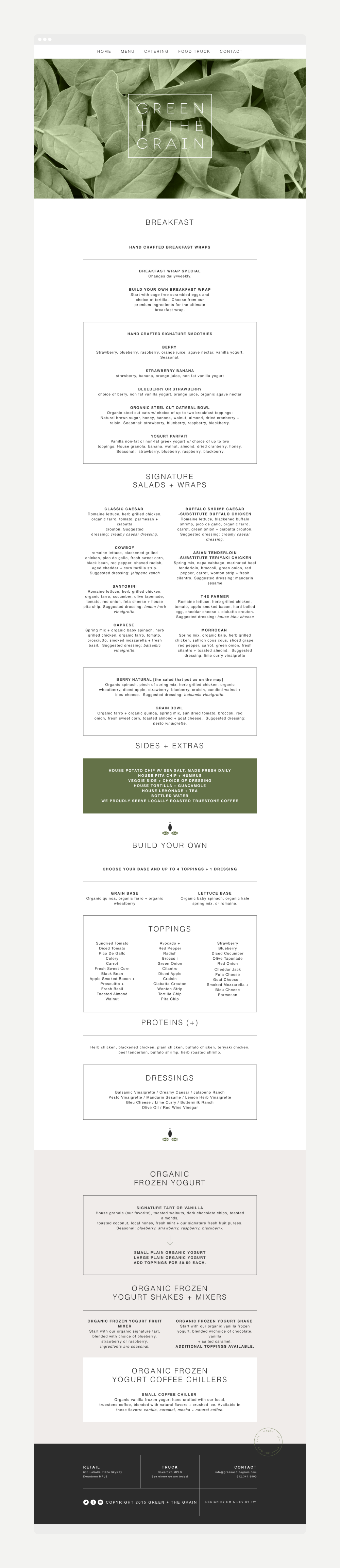
The end result is simple, but fresh. And it gives them a lot of usage flexibility as well, which is always a plus! But that wasn't the end of our time together. We also worked on creating a responsive and dynamic website, with the focus being on their menu, which was my favorite part. You can see a screenshot below, but it's much more fun to click around yourself, which you can do right here. Development by Tom Wilz.
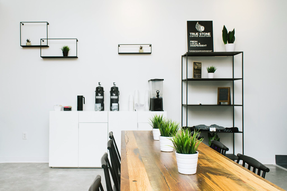
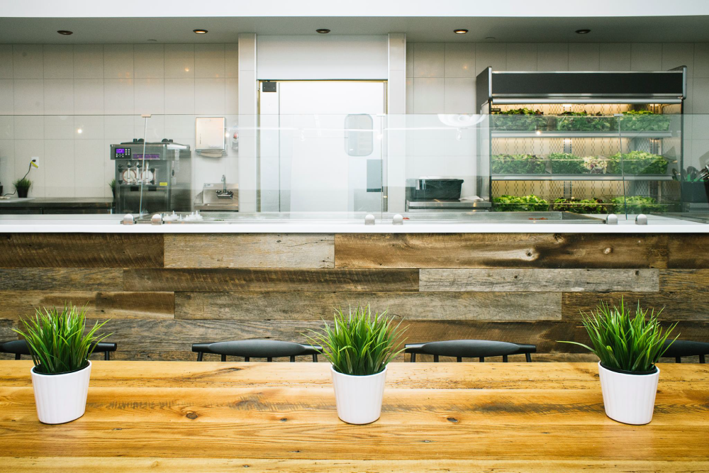
I haven't been to their new location yet, but I definitely plan on it! Tiffany did such a great job with the interior (check out the above photos!!), so I can't wait to see everything in person. And eat some frozen yogurt too, because why not??