New Work: Sugar & Cloth
When Ashley + Jared of Sugar & Cloth approached me to redesign their lifestyle blog last year, it was a no brainer. They've been my go to DIY source for as long as I can remember and it was fun to be apart of their fresh website redesign. Its been live for a little while now, so I thought I'd chat about the process.
Unlike most projects, this one didn't require any branding beforehand (other than some kerning of their existing logo), so we dove head first into the website redesign. The old Sugar & Cloth blog was fairly standard with the traditional two column blog layout that you see so often. And while we didn't want to stray too far away from that, we did want to level up on how everything was presented so that it was much easier for readers to browse the archives and find things faster.

The homepage begins with a featured post (or recent post) box that readers can toggle between. This helps give the blog a bit more of a visual punch upon first load, while also allowing Ashley + Jared to select what people see. Below this, we kept to a fairly traditional layout where posts can be read chronologically.

Screenshots really don't do the Sugar & Cloth website justice in terms of all the fun features, so definitely check it out live right here and click + hover around. Other notable features include:
01. CATEGORIES Sugar & Cloth has a huge archive that's only going to get bigger, so we wanted to make sure it was extremely easy for readers to browse through different categories (like this) and even dive deeper into sub-categories. Once you land on a category page, you see everything from that category in an organized grid. But above that, you can also narrow down your search and pin-point exactly what you're looking for, which was an important feature we wanted to gracefully tackle.
02. SHOP Because the Sugar & Cloth brand has a large following, they are considered influencers and like to share some of their favorite shops + products. Typically, you'll see this done via a simple Rewards Style plugin, which is fine, but we wanted to take it a step further. Instead, we created a landing page that divides things into categories so that again, readers can get really specific about what they are looking for. From there, they'll see that organized grid show up again and can always easily toggle to a different category. I also just really like these icons. ;)

03. EVENTS Sugar & Cloth also likes to host a variety of events each year, so we wanted to create a prominent place on the website for those. We used the same setup from the homepage to feature upcoming events because consistency is king. ;) But more importantly, we also wanted to highlight past events so that interested readers could feel out what events are actually like. It's a great setup for a page that has it's own archive system.
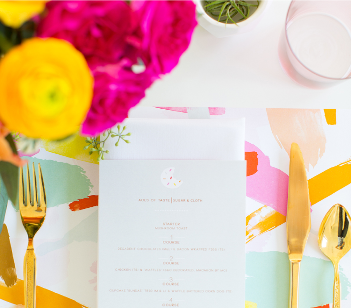
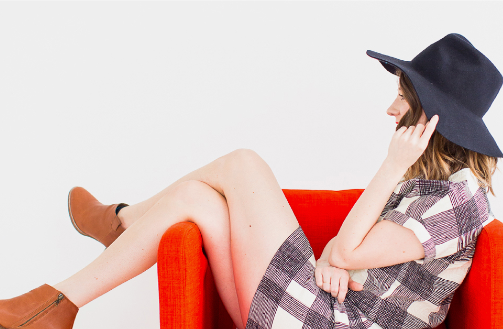
I could go on and on about some of my favorite features, but I'll let you explore the rest of the site yourself. ;) I don't design a lot of blogs, so it was extremely refreshing to work on something a bit more unique with beautiful photography to boot. Now I just need to get my ducks in a row and upload this project to the Rowan Made portfolio! In the meantime, you can follow along with recent work on my instagram account since that's the most frequently updated platform I use. See you there!