Trying Out Square Moodboards
For the past few months, I've been trying out a new moodboard method after being inspired by my friend Jen, who's been practicing this for awhile now. Basically, the idea is that instead of fitting a bunch of images together like a perfect puzzle (like this or this), I pull project inspiration and fit those images into a simple grid of squares. Doing this helps give each image some breathing room and quite honestly, has saved me SO much time.
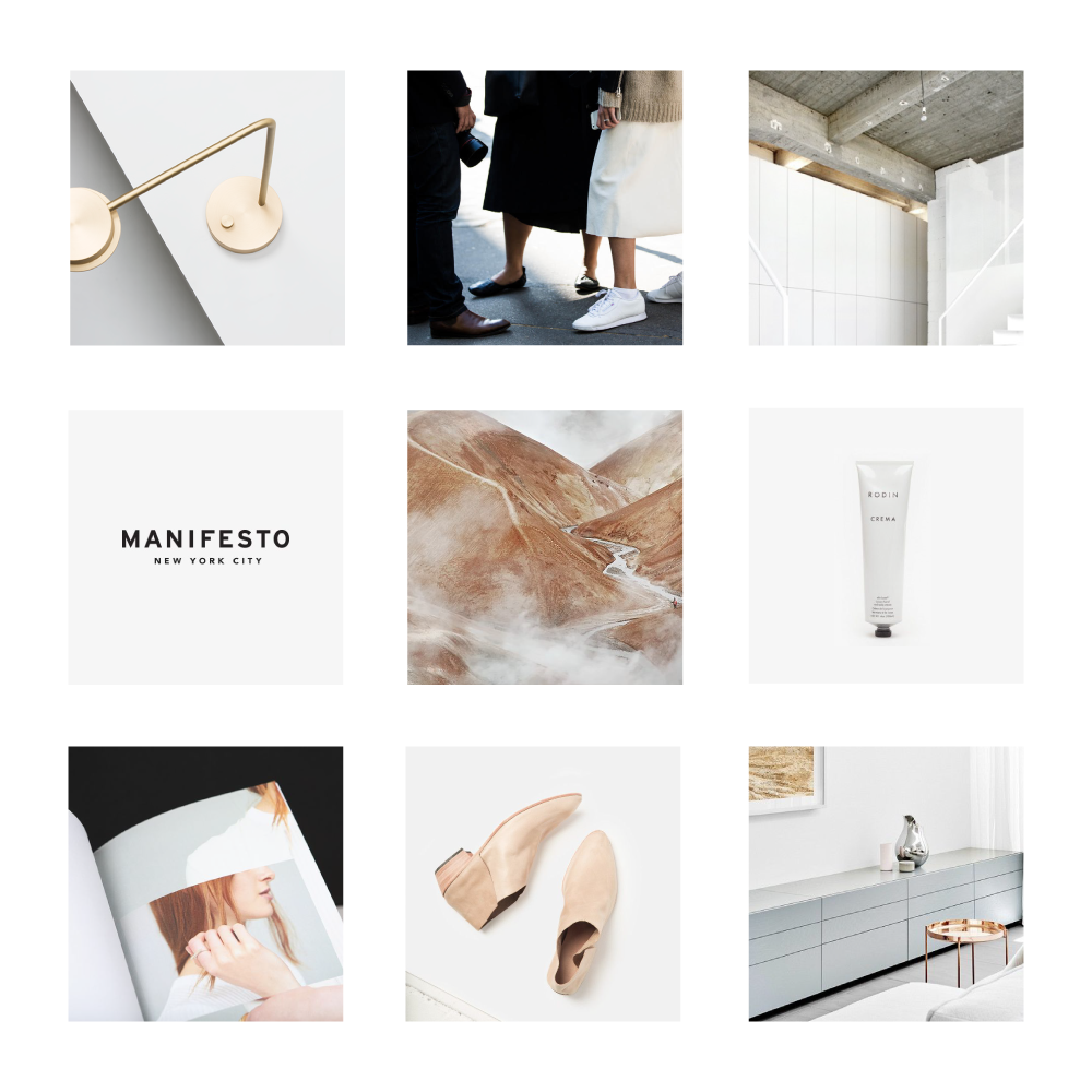
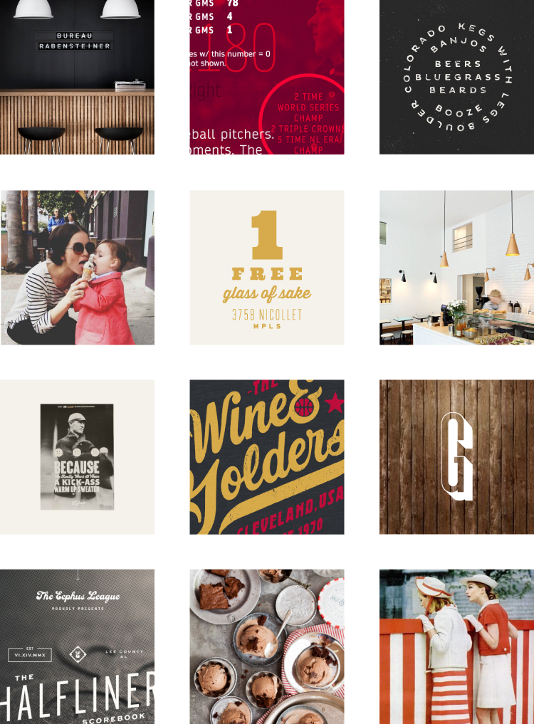
To help explain this a bit better, let's take a look at one of my current projects for YUM, an up and coming fro-yo shop in small town North Dakota. After chatting with my client and figuring out what their goals and ideas were, it was clear that we could take two distinct directions. The first was to focus more on nostalgia while also integrating a subtle sports theme, because this particular town would enjoy that. So: vintage sports. The second idea was to keep that subtle sports theme in check, but in a younger way since this shop will mostly be visited by families with kids. So: young, modern, and sporty. Keeping this in mind, I created one moodboard for each concept. Here is the first one:
As you can see, this moodboard takes inspiration from typography in sports, while adding a bit of texture to help round out that vintage vibe. There's also a distinct color palette represented, connecting everything in a cohesive way. Sure, I could have carefully composed these same images into a beautiful moodboard like I used to, but that would have taken me at least triple the amount of time. Plus, there's plenty of room for choosing the right imagery with this approach. Not just what fits into your perfect puzzle. So now, let's look at the second moodboard ...
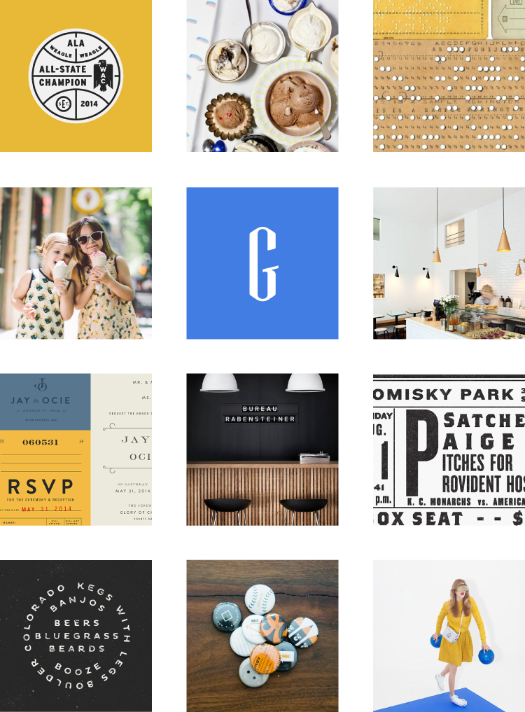
This time around, the moodboard feels distinctively younger as well as a bit more modern. There's also some imagery crossover, but that's because the sports theme remains constant between both boards. The typography and color, however, are slightly different. And those subtle changes make all the difference!
QUICK TIP
When presenting moodboards, I always include a little context about what the client is looking at, especially if its being delivered via email. Typically, this means that I'll create a four page PDF presentation. Page one outlines the idea (and color palette) behind moodboard one, which is shown on the following page. Then on page three, I outline the second moodboard (and color palette) and finish off the presentation (page four) with the second moodboard.
And that's about it! This method is rather simple, but highly efficient. I also love that it allows me to dive deeper into different concepts, rather than forcing everything into one board. So what do you say ... curious to give it a try next time? Let me know how it goes. ;)